Moving On From Obsidian Publish
Ryan Hayden • October 3, 2022
obsidian technologyI spent some time this weekend setting up a proper blog, and moving my content from Obsidian Publish over to here. I want to explain why and how I did it, and talk about why I love the idea of Obsidian Publish but not the execution.
Why I signed up for Obsidian Publish
The reason I paid $20 per month to setup Obsidian Publish in the first place is because I loved the idea of being able to blog my notes directly from my note writing software, without having to do any configuration.
Obsidian Publish is indeed great for that. You write. You click the publish button. It magically shows up on your site. It could not get easier and does exactly what its supposed to.
Why I moved on
As great as Obsidian Publish is, and as much as I loved the ease of publishing, there were some problems I ran into that, for me, didn't justify the subscription.
First, Obsidian Publish is too expensive
At $20 per month, I just couldn't justify that expense for my hobby blog. Maybe if it did everything I wanted it to, I'd change my mind, but almost immediately I had buyer's remorse.
Second, Obsidian Publish isn't really made for blogging.
It's made for publishing your notes. It's very, very good at publishing your notes. But notes are not a blog. Publish was lacking on these fronts:
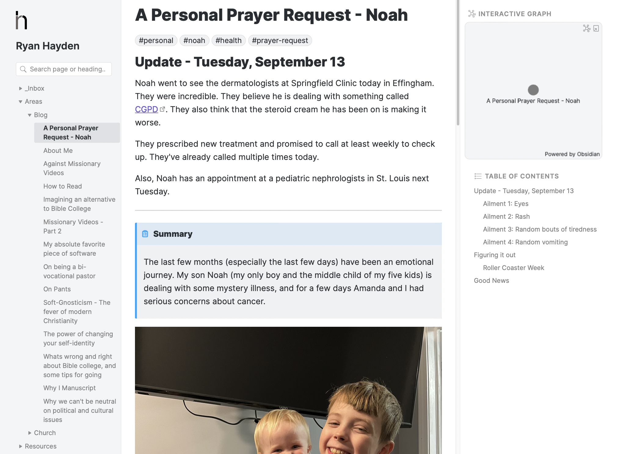
- Appearance: I really disliked the way Obsidian Publish made my blog look. I love the three pane look for my notes, but not for my blog. I wouldn't want to read a blog that looked like that, and I doubt my readers did either.
- Comments: I couldn't setup comments. That was a promised feature of Obsidian Publish that hasn't come to be yet. Having comments is half the fun of having a blog.
- Sharing: I didn't like the way Obsidian Publish links looked when shared on Social Media. Despite photos being at the top of my posts, they never showed a preview photo. People didn't know what to do with the link.
- Navigation: I didn't like the way Obsidian Publish's folder structure worked for a blog. The sidebar with Areas > Blog and Resources > Readwise didn't make sense to people.
Yes, I could make publish better by customizing it, but I came to the realization that I was asking a hammer to be a screw driver and would never be happy with how it looked as long as I was trying to do something it wasn't intended for.
What I'm doing now
I've switched this blog over to a static site generator called Jigsaw. Jigsaw is made using Laravel, Vue and Tailwind - three technologies I work in every day, so customizing it will be second nature for me. I'm using the standard blog template, which I find to be very good, and I plan to slowly customize it and to add some tools for sermons.
I'm writing some shell scripts on my computer that take a file from Obsidian, edit it to match what Jigsaw expects, and moves it into the folder. So publishing will be fairly easy.
And I'm hosting the blog on github pages - so its basically free.
Let me know what you think
Let me know what you think in the comments below. What would you change? What would you add? I'm curious.

Comments powered by Talkyard.